 39e34af998
* Safely subscribe to on stateChanged events to prevent related events from failing if listeners throw an error * Ensure anonymous function can be subscribed and unsubscribed * Resolve linter issues * Update unsubscription calls * Resolve linter issues * Update CallErrorTarget * Change files |
||
|---|---|---|
| .devcontainer | ||
| .github | ||
| .vscode | ||
| change | ||
| change-beta | ||
| common | ||
| docs | ||
| packages | ||
| samples | ||
| tools | ||
| .eslintignore | ||
| .gitattributes | ||
| .gitignore | ||
| .prettierignore | ||
| .prettierrc | ||
| CHANGELOG.md | ||
| CONTRIBUTING.md | ||
| LICENSE.md | ||
| README.md | ||
| SECURITY.md | ||
| beachball.config.js | ||
| package.json | ||
| rush.json | ||
README.md
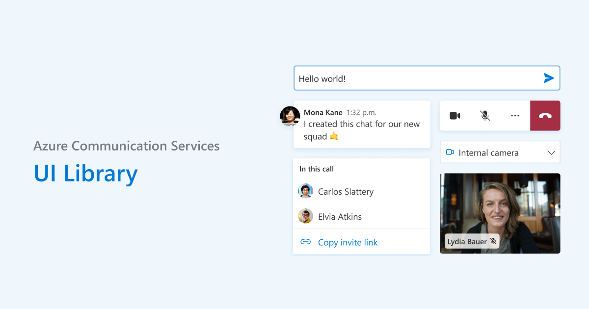
Azure Communication Services UI Library
The Azure Communication Services UI Library is a collection of JavaScript libraries designed to help you easily build fast, responsive communication web applications.
Explore interactive storybook pages in our documentation 📖 to try out features and examples, and kickstart your development journey 🚀.
Getting Started
If you're wondering where to start, here are a few scenarios to guide you:
-
What is Azure Communication Services?
- Dive into our conceptual documentation on Azure Communication Services, Client-Server Architecture, Authentication, Calling, and Chat.
-
I want to see what this library can do!
- Explore our Storybook and Sample Apps.
-
I want to write my own communication application
- Start with our comprehensive documentation to make the best choices for your application.
-
I want more information on the available npm packages
- Check out our npm packages on offer.
-
I want to contribute and submit a fix for a package in this repo
- Refer to our contributing guide for the steps to get started.
NPM Packages
@azure/communication-react
This React library provides UI components, simplifying the development of modern communication apps using Azure Communication Services.
Samples
Explore Storybook to try out the UI Library today!
Contributing to the Packages or Samples
Join us in contributing to this open source library. Get started by checking out our contributing guide.
We look forward to building an amazing open source library with you!