* Remove backQueue usage * Bump release version * Update dependencies * Revert if statement logic |
||
|---|---|---|
| .. | ||
| gradle/wrapper | ||
| library | ||
| nav_sample | ||
| sample | ||
| screenshots | ||
| .gitignore | ||
| README.md | ||
| build.gradle | ||
| dependencies.gradle | ||
| gradle.properties | ||
| gradlew | ||
| gradlew.bat | ||
| ktlint.gradle | ||
| publishing.gradle | ||
| settings.gradle | ||
README.md
TwoPaneLayout - Surface Duo Compose SDK
TwoPaneLayout is a Jetpack Compose component that helps you create UI for dual-screen, foldable, and large-screen devices. TwoPaneLayout provides a two-pane layout for use at the top level of a UI. The component will place two panes side-by-side when the app is spanned on dual-screen, foldable and large-screen devices, otherwise only one pane will be shown. These panes can be horizontal or vertical, depending on the orientation of the device and the selected paneMode. TwoPaneLayoutNav is a new version of TwoPaneLayout that can be used for complex navigation scenarios, and it follows the same pane logic as the original TwoPaneLayout.
When the app is spanned across a separating vertical hinge or fold, or when the width is larger than height of the screen on a large-screen device, pane 1 will be placed on the left, while pane 2 will be on the right. If the device rotates, the app is spanned across a separating horizontal hinge or fold, or the width is smaller than the height of screen on large-screen device, pane 1 will be placed on the top and pane 2 will be on the bottom.
Add to your project
-
Make sure you have
mavenCentral()repository in your top level build.gradle file:allprojects { repositories { google() mavenCentral() } } -
Add dependencies to the module-level build.gradle file (current version may be different from what's shown here).
implementation "com.microsoft.device.dualscreen:twopanelayout:1.0.1-alpha08" -
Also ensure the compileSdkVersion is set to API 33 and the targetSdkVersion is set to API 32 or newer in the module-level build.gradle file.
android { compileSdkVersion 33 defaultConfig { targetSdkVersion 32 } ... } -
Build layout with TwoPaneLayout or TwoPaneLayoutNav. Please refer to the TwoPaneLayout sample and TwoPaneLayoutNav sample for more details.
API reference
The sections below describe how to use and customize TwoPaneLayout for different scenarios. Please refer to the TwoPaneLayout documentation for more details.
To learn more about common use cases for two-pane layouts, please check out the dual-screen user interface patterns.
TwoPaneLayout
The main TwoPaneLayout constructors both accept parameters for a modifier, pane mode, and content to show in pane 1 and pane 2. The second constructor also accepts a NavHostController parameter, which is useful for accessing navigation information in your app.
@Composable
fun TwoPaneLayout(
    modifier: Modifier = Modifier,
    paneMode: TwoPaneMode = TwoPaneMode.TwoPane,
    pane1: @Composable TwoPaneScope.() -> Unit,
    pane2: @Composable TwoPaneScope.() -> Unit
)

@Composable
fun TwoPaneLayout(
    modifier: Modifier = Modifier,
    paneMode: TwoPaneMode = TwoPaneMode.TwoPane,
    navController: NavHostController,
    pane1: @Composable TwoPaneScope.() -> Unit,
    pane2: @Composable TwoPaneScope.() -> Unit
)
The content shown in each pane can access methods from the TwoPaneScope interface:
interface TwoPaneScope {

    fun Modifier.weight(weight: Float): Modifier

    fun navigateToPane1()

    fun navigateToPane2()

    val currentSinglePaneDestination: String

    val isSinglePane: Boolean
}
The weight modifier is described in more detail below.
When writing UI tests for composables that use TwoPaneScope, you can use the TwoPaneScopeTest class. It provides empty implementations of TwoPaneScope methods, and you can set the values of currentSinglePaneDestination and isSinglePane in the class constructor before running your tests.
class TwoPaneScopeTest(
    currentSinglePaneDestination: String = "",
    isSinglePane: Boolean = true
) : TwoPaneScope
Pane mode
The pane mode affects when two panes are shown for TwoPaneLayout. By default, whenever there is a separating fold or a large window, two panes will be shown, but you can choose to show only one pane in these cases by changing the pane mode.
A separating fold means there's a FoldingFeature present that returns true for the isSeparating property.
A large window is one with a width WindowSizeClass of EXPANDED and a height size classs of at least MEDIUM.
enum class TwoPaneMode {
    TwoPane,
    HorizontalSingle,
    VerticalSingle,
    SinglePane
}
There are four pane modes available for TwoPaneLayout:
-
TwoPane- default mode, always shows two panes when there is a separating fold or large window, regardless of the orientation -
HorizontalSingle- shows one big pane when there is a horizontal separating fold or a portrait large window (combines top/bottom panes)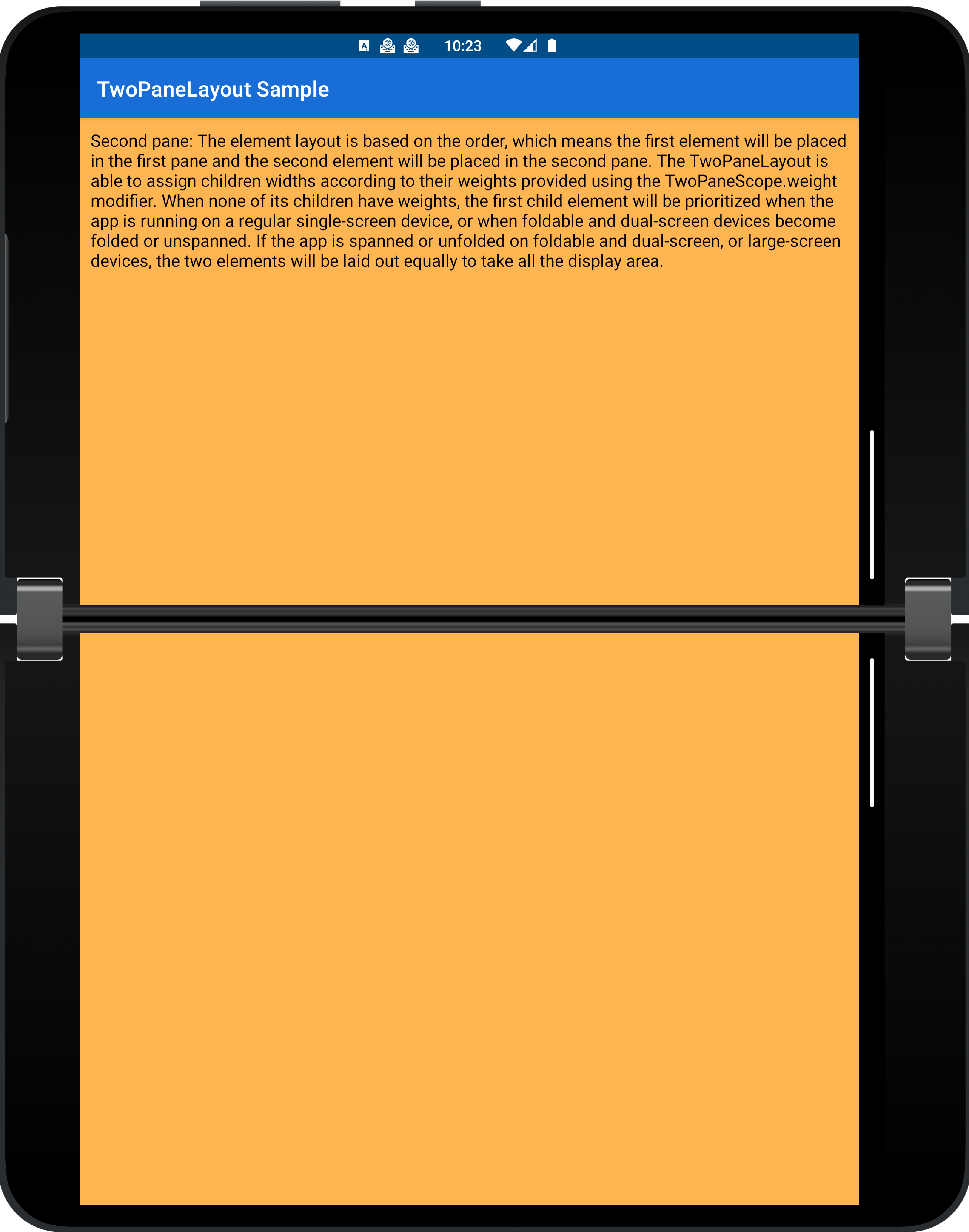
-
VerticalSingle- shows one big pane when there is a vertical separating fold or a landscape large window (combines left/right panes)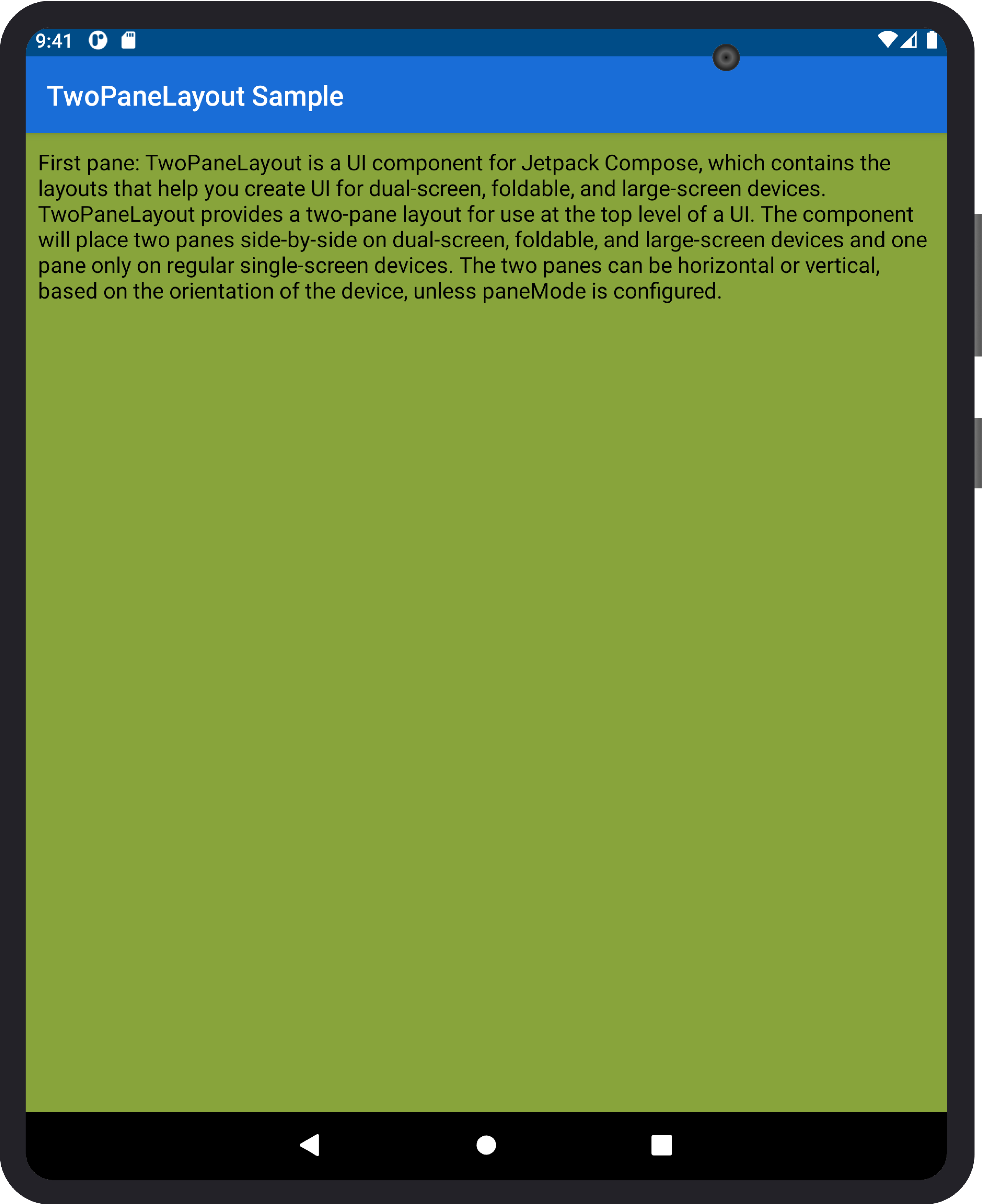
-
SinglePane- always shows one pane, regardless of window features and orientation
This table explains when one 🟩 or two 🟦🟦 panes will be shown for different pane modes and device configurations:
| Pane mode | Small window without separating fold | Portrait large window / horizontal separating fold | Landscape large window / vertical separating fold |
|---|---|---|---|
TwoPane |
🟩 | 🟦🟦 | 🟦🟦 |
HorizontalSingle |
🟩 | 🟩 | 🟦🟦 |
VerticalSingle |
🟩 | 🟦🟦 | 🟩 |
SinglePane |
🟩 | 🟩 | 🟩 |
Weight modifier
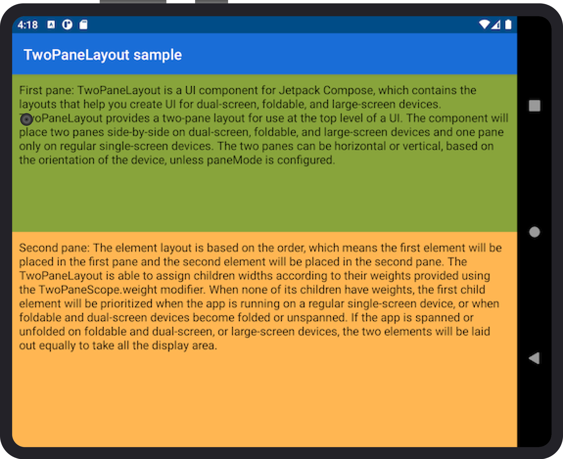
TwoPaneLayout is able to assign children widths or heights according to their weights provided using the TwoPaneScope.weight and TwoPaneNavScope.weight modifiers. This only affects the layout for large screen and foldable devices, but for single-screen devices, there will still only be one pane visible, regardless of the weight.
fun Modifier.weight(weight: Float): Modifier
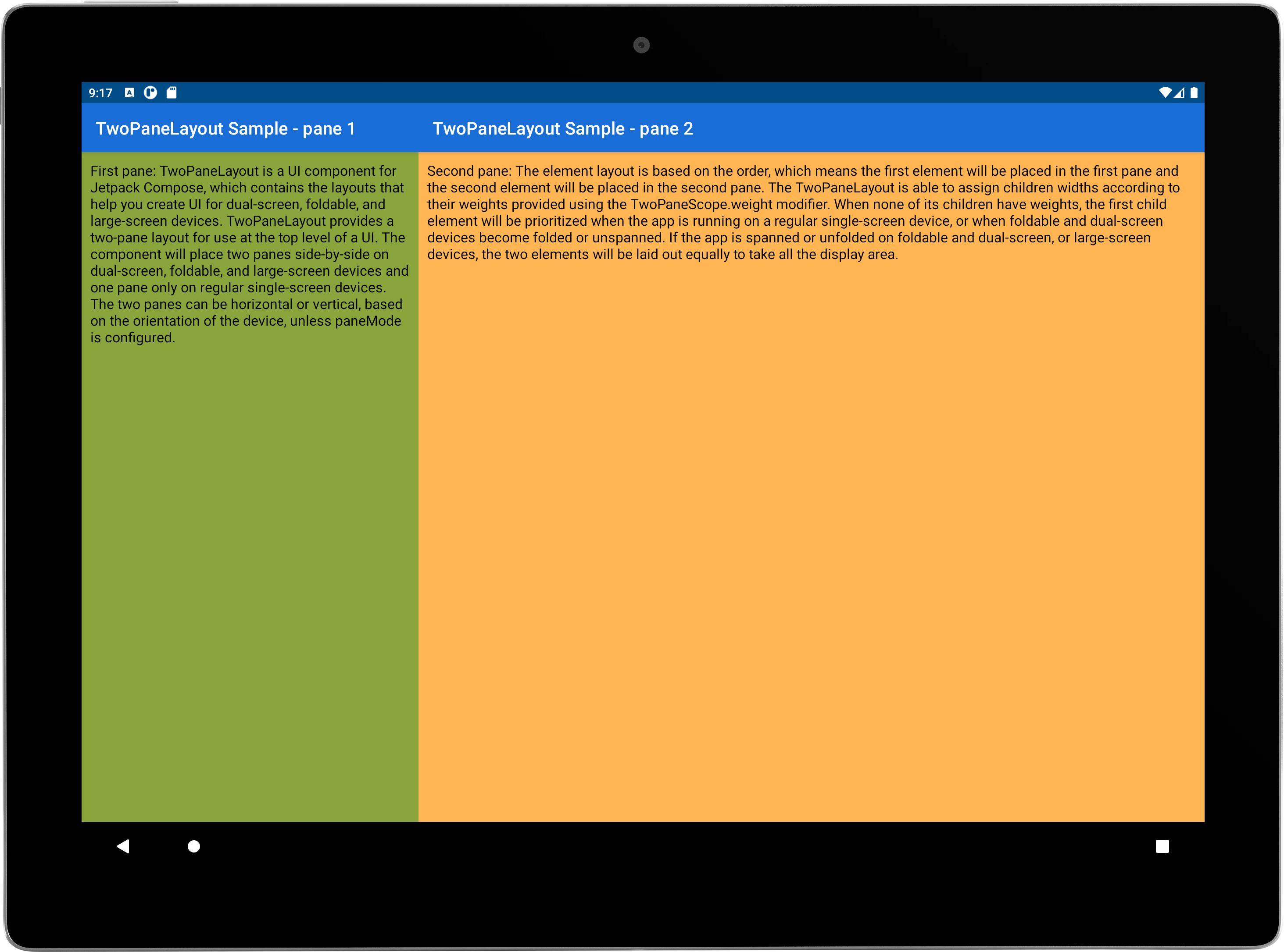
For large screens:
-
No weight → two panes displayed equally
-
Weight → layout split up proportionally according to the weight
For foldables:
-
Separating fold → layout split up according to fold boundaries (with or without weight)

-
Non-separating fold → device treated as a large screen or single-screen depending on its size
TwoPaneLayoutNav
The TwoPaneLayoutNav constructor can be used for more complicated navigation scenarios. It accepts parameters for a modifier, pane mode, NavHostController, navigation graph, and start destinations.
@Composable
fun TwoPaneLayoutNav(
    modifier: Modifier = Modifier,
    navController: NavHostController,
    paneMode: TwoPaneMode = TwoPaneMode.TwoPane,
    singlePaneStartDestination: String,
    pane1StartDestination: String,
    pane2StartDestination: String,
    builder: NavGraphBuilder.() -> Unit
)
The content shown in each destination can access methods from the TwoPaneNavScope interface:
interface TwoPaneNavScope {

    fun Modifier.weight(weight: Float): Modifier

    fun NavHostController.navigateTo(
        route: String,
        launchScreen: Screen,
        builder: NavOptionsBuilder.() -> Unit = { }
    )

    fun NavHostController.navigateBack(): Boolean

    fun NavHostController.navigateUpTo(
        route: String,
        inclusive: Boolean = false
    ): Boolean

    val twoPaneBackStack: List<TwoPaneBackStackEntry>

    val currentSinglePaneDestination: String

    val currentPane1Destination: String

    val currentPane2Destination: String

    val isSinglePane: Boolean
}
The navigateTo method is an enhanced version of the navigate method from NavHostController that works when one or two panes are shown. The launchScreen parameter determines which pane, or screen, a destination should be shown in when in two pane mode: Screen.Pane1 or Screen.Pane2.
sealed class Screen(val route: String) {

    object Pane1 : Screen("pane1")

    object Pane2 : Screen("pane2")
}
The navigateBack method is an enhanced version of the navigateUp method from NavHostController that also works when one or two panes are shown. If navigation is successful, the function will return true, otherwise it will return false.
The navigateUpTo method calls navigateBack until you reach your desired destination, allowing you to pop several destinations off the backstack at once. Note that, as expected when calling navigateBack in dual-screen mode, if there are fewer than two destinations left in the backstack, the activity will be finished. So, if your stack is [A, B, C] in dual-screen mode and you call navigateUpTo("A"), then the activity will be finished.
TwoPaneLayoutNav manages an internal backstack to maintain state across configuration changes. To access and update the backstack, use the twoPaneBackStack mutable list field.
If you want to override the default back press behavior and write a custom handler, make sure you call
navigateBackto maintain the backstack correctly.
When writing UI tests for composables that use TwoPaneNavScope, you can use the TwoPaneScopeNavTest class. It provides empty implementations of TwoPaneNavScope methods, and you can set the values of currentSinglePaneDestination, currentPane1Destination, currentPane2Destination, and isSinglePane in the class constructor before running your tests.
class TwoPaneNavScopeTest(
    currentSinglePaneDestination: String = "",
    currentPane1Destination: String = "",
    currentPane2Destination: String = "",
    isSinglePane: Boolean = true
) : TwoPaneNavScope
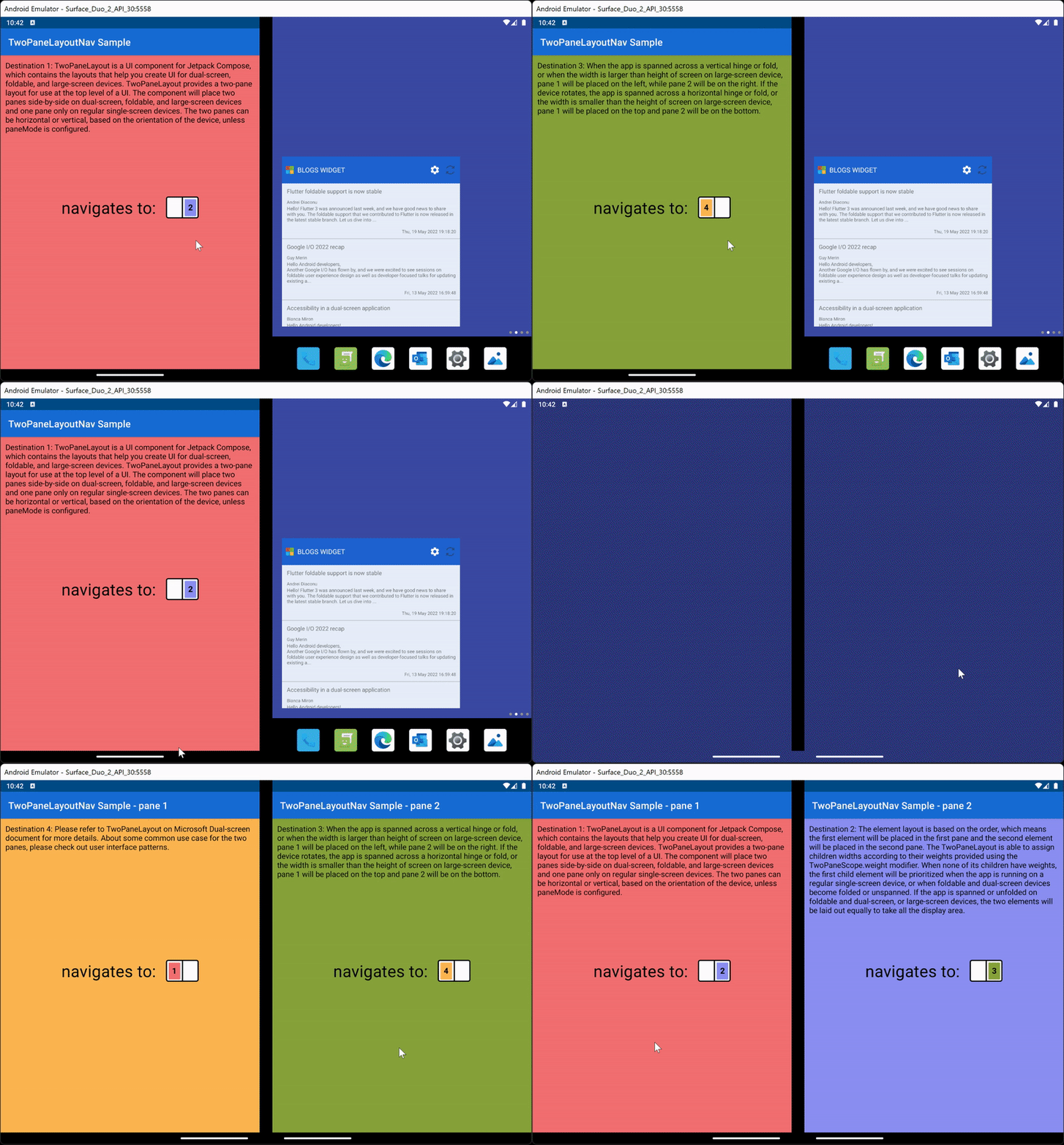
The animation below shows an example of how to use TwoPaneLayoutNav to create custom navigation flows. The layout was created with four app destinations, where destination 1 was passed in as the singlePaneStartDestination and pane1StartDestination and destination two was passed in as the pane2StartDestination. The navigation flow, which works in both single and two pane modes, uses navigateTo to go from destination 1-4 in panes 1, 2, 2, and 1 respectively.
Contributing
This project welcomes contributions and suggestions. Most contributions require you to agree to a Contributor License Agreement (CLA) declaring that you have the right to, and actually do, grant us the rights to use your contribution. For details, visit https://cla.opensource.microsoft.com.
When you submit a pull request, a CLA bot will automatically determine whether you need to provide a CLA and decorate the PR appropriately (e.g., status check, comment). Simply follow the instructions provided by the bot. You will only need to do this once across all repos using our CLA.
This project has adopted the Microsoft Open Source Code of Conduct. For more information see the Code of Conduct FAQ or contact opencode@microsoft.com with any additional questions or comments.
License
Copyright (c) Microsoft Corporation.
MIT License
Permission is hereby granted, free of charge, to any person obtaining a copy of this software and associated documentation files (the "Software"), to deal in the Software without restriction, including without limitation the rights to use, copy, modify, merge, publish, distribute, sublicense, and/or sell copies of the Software, and to permit persons to whom the Software is furnished to do so, subject to the following conditions:
The above copyright notice and this permission notice shall be included in all copies or substantial portions of the Software.
THE SOFTWARE IS PROVIDED AS IS, WITHOUT WARRANTY OF ANY KIND, EXPRESS OR IMPLIED, INCLUDING BUT NOT LIMITED TO THE WARRANTIES OF MERCHANTABILITY, FITNESS FOR A PARTICULAR PURPOSE AND NONINFRINGEMENT. IN NO EVENT SHALL THE AUTHORS OR COPYRIGHT HOLDERS BE LIABLE FOR ANY CLAIM, DAMAGES OR OTHER LIABILITY, WHETHER IN AN ACTION OF CONTRACT, TORT OR OTHERWISE, ARISING FROM, OUT OF OR IN CONNECTION WITH THE SOFTWARE OR THE USE OR OTHER DEALINGS IN THE SOFTWARE.
