|
|
||
|---|---|---|
| .. | ||
| src | ||
| styles | ||
| CHANGELOG.md | ||
| README.md | ||
| gulpfile.js | ||
| license | ||
| package.json | ||
| tsconfig.json | ||
README.md
Angular Buttons Components
What's Included in the Angular Buttons Package
The Angular Buttons package includes the following list of components.
Angular Button
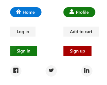
The Angular Button component is a custom HTML5 button component. It has several built-in features such as support for icons, predefined styles, different button types, different button sizes, and UI customization.
Getting Started . Online demos . Learn more

Key features
- Types - Provided with different types of Button.
- Predefined styles - Provided with predefined styles of Button.
- Sizes - Provided with different sizes of Button.
- Icons - Supports text and icon on the Button.
Angular CheckBox
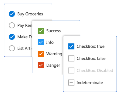
The Angular CheckBox component is a custom checkbox-type HTML5 input component for selecting one or more options from a list of predefined choices. It supports an indeterminate state, different sizes, custom labels and positions, and UI customization.
Getting Started . Online demos . Learn more

Key features
- States - Provided with different states of CheckBox.
- Label - Supports label and its positioning.
- Sizes - Provided with different sizes of CheckBox.
Angular RadioButton
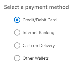
The Angular RadioButton component is a custom radio-type HTML5 input component for selecting one option from a list of predefined choices. It supports different states, sizes, labels, label positions, and UI customizations.
Getting Started . Online demos . Learn more

Key features
- States - Provided with different states of RadioButton.
- Label - Supports label and its positioning.
- Sizes - Provided with different sizes of RadioButton.
Angular Switch
The Angular Switch component is a custom HTML5 input-type component control that allows you to perform a toggle (on/off) action between checked and unchecked states. It supports different sizes, labels, label positions, and UI customization.
Getting Started . Online demos . Learn more

Key features
Trusted by the world's leading companies

Setup
To install buttons and its dependent packages, use the following command.
npm install @syncfusion/ej2-angular-buttons
Supported frameworks
Button components are available in following list of frameworks.
 JavaScript |
 React |
 Vue |
 ASP.NET Core |
 ASP.NET MVC |
|---|
Showcase samples
Support
Product support is available through following mediums.
- Support ticket - Guaranteed Response in 24 hours | Unlimited tickets | Holiday support
- Community forum
- GitHub issues
- Request feature or report bug
- Live chat
Changelog
Check the changelog here. Get minor improvements and bug fixes every week to stay up to date with frequent updates.
License and copyright
This is a commercial product and requires a paid license for possession or use. Syncfusion’s licensed software, including this component, is subject to the terms and conditions of Syncfusion's EULA. To acquire a license for 80+ Angular UI components, you can purchase or start a free 30-day trial.
A free community license is also available for companies and individuals whose organizations have less than $1 million USD in annual gross revenue and five or fewer developers.
See LICENSE FILE for more info.
© Copyright 2023 Syncfusion, Inc. All Rights Reserved. The Syncfusion Essential Studio license and copyright applies to this distribution.