|
|
||
|---|---|---|
| .. | ||
| src | ||
| CHANGELOG.md | ||
| README.md | ||
| gulpfile.js | ||
| license | ||
| package.json | ||
| tsconfig.json | ||
README.md
Angular Circular Gauge Component
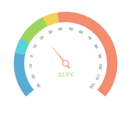
The Angular Circular Gauge component is ideal to visualize numeric values over a circular scale. All the circular gauge elements are rendered using Scalable Vector Graphics (SVG).
Getting started . Online demos . Learn more

Trusted by the world's leading companies

Setup
Create an Angular Application
You can use Angular CLI to setup your Angular applications. To install the Angular CLI, use the following command.
npm install -g @angular/cli
Create a new Angular application using the following Angular CLI command.
ng new my-app
cd my-app
Adding Syncfusion Circular Gauge package
All Syncfusion Angular packages are available in npmjs.com. To install the Angular Circular Gauge package, use the following command.
npm install @syncfusion/ej2-angular-circulargauge
The above command does the below configuration to your Angular app.
- Adds
@syncfusion/ej2-angular-circulargaugepackage and its peer dependencies to yourpackage.jsonfile. - Imports the
CircularGaugeModulein your application moduleapp.module.ts. - Registers the Syncfusion UI default theme (material) in the
angular.jsonfile.
This makes it easy to add the Syncfusion Angular Circular Gauge module to your project and start using it in your application.
Add Circular Gauge component
In src/app/app.component.ts, use <ejs-circulargauge> selector in the template attribute of the @Component directive to render the Syncfusion Angular Circular Gauge component.
import { Component } from '@angular/core';

@Component({
selector: 'app-container',
template:
`<ejs-circulargauge id="circular-container">
    <e-axes>
        <e-axis>
            <e-pointers>
                <e-pointer value=35></e-pointer>
            </e-pointers>
        </e-axis>
    </e-axes>
</ejs-circulargauge>`
})

export class AppComponent {

}
Supported frameworks
Circular Gauge component is also offered in the following list of frameworks.
 JavaScript |
 React |
 Vue |
 ASP.NET Core |
 ASP.NET MVC |
|---|
Showcase samples
Key features
- Arc Gauge/Radial Gauge: The arc gauge or radial gauge helps in the visualization of numerical values of scales in a semi-circular or quarter-circular manner. It is possible to achieve this by changing the start and end angle values.
- Axes: Axes is a collection of circular axis that can be used to indicate numeric values.
- Ranges: Supports ranges to categorize the axis values. Any number of ranges can be added to the circular gauge.
- Ticks and labels: Provides options to customize the ticks and labels of the gauges.
- Pointers: Indicates the values on axis. Circular gauge supports three types of pointers: needle, range bar, and marker.
- Annotation: Uses any custom HTML element as annotation and place it anywhere on the gauge.
- Legend: Summarizes the information from the ranges.
- Tooltip: Provides information about the pointer and range values on hover.
- Pointer drag: Provides support to place a pointer at the desired values by dragging it.
- Range drag: Provides support to extend the start or end of the range at the desired values by dragging it.
- Print and Export: Prints or exports the rendered circular gauge to a desired format. Exporting supports four formats: PDF, PNG, JPEG and SVG.
- Templates: Templates can be used to create custom user experience in the tooltip of the circular gauge.
- Globalization: Personalize the circular gauge component with different languages, as well as culture-specific number, date and time formatting.
- Accessibility: Provides with built-in accessibility support which helps to access all the circular gauge component features through the keyboard, screen readers, or other assistive technology devices.
Support
Product support is available through the following mediums.
- Support ticket - Guaranteed Response in 24 hours | Unlimited tickets | Holiday support
- Community forum
- GitHub issues
- Request feature or report bug
- Live chat
Changelog
Check the changelog here. Get minor improvements and bug fixes every week to stay up to date with frequent updates.
License and copyright
This is a commercial product and requires a paid license for possession or use. Syncfusion’s licensed software, including this component, is subject to the terms and conditions of Syncfusion's EULA. To acquire a license for 80+ Angular UI components, you can purchase or start a free 30-day trial.
A free community license is also available for companies and individuals whose organizations have less than $1 million USD in annual gross revenue and five or fewer developers.
See LICENSE FILE for more info.
© Copyright 2022 Syncfusion, Inc. All Rights Reserved. The Syncfusion Essential Studio license and copyright applies to this distribution.