5.2 KiB
| title | page_title | description | slug | tags | position |
|---|---|---|---|---|---|
| Customizing a Theme | Customize a Theme | Learn how to customize the Telerik Theme for your .NET MAUI application and alter the default appearance of the UI for .NET MAUI components. | themes-customization | telerik,.net maui,theme,custom | 1 |
Customizing a Theme
The Telerik UI for .NET MAUI themes are flexible and allow you to customize and adjust them to meet the specific application requirements.
Depending on the changes that you want to apply, you can customize the appearance of the Telerik UI for .NET MAUI controls in a couple of ways:
- You can modify only the colors in a certain color variation (swatch)—this will affect all the Telerik UI controls.
- You can change the styles and templates for a specific Telerik UI control.
Both customization approaches require the following steps:
- Copying the needed resources in a separate resource dictionary and modifying them.
- Merging the modified resource dictionary after the Telerik theme resources.
Before proceeding with the next steps, make sure the [Telerik Theming is enabled]({%slug themes-overview%}#using-the-maui-theming).
Copying and Modifying the Theme Resources
All available theme styles are in the TelerikTheming folder:
- The color variations are in the
Swatchesfolder. - The styles and templates for the Telerik UI for .NET MAUI controls are in the
Stylesfolder.
To modify the theme resources:
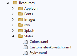
1. Go to the Resources/Styles folder and create a ResourceDictionary file without a code-behind file, similar to the default Styles.xaml and Colors.xaml:
2. Copy the needed colors or styles from the swatch that you need to modify and paste them into the newly created ResourceDictionary file. Apply the required changes based on your design requirements. For example, you can modify the primary colors of a swatch:
<?xml version="1.0" encoding="UTF-8" ?>
<?xaml-comp compile="true" ?>
<ResourceDictionary
    xmlns="http://schemas.microsoft.com/dotnet/2021/maui"
    xmlns:x="http://schemas.microsoft.com/winfx/2009/xaml"
    xmlns:telerik="http://schemas.telerik.com/2022/xaml/maui">

    <!-- Primary -->
    <Color x:Key="RadPrimarySubtleColor">#D0E3EE</Color>
    <Color x:Key="RadPrimarySubtleHoverColor">#B8D5E6</Color>
    <Color x:Key="RadPrimarySubtleActiveColor">#A0C7DE</Color>
    <Color x:Key="RadPrimaryColor">#74AC12</Color>
    <Color x:Key="RadPrimaryHoverColor">#689B10</Color>
    <Color x:Key="RadPrimaryActiveColor">#5D8A0E</Color>
    <Color x:Key="RadPrimaryEmphasisColor">#ACCD71</Color>
    <Color x:Key="RadPrimaryOnSubtleColor">#2E4507</Color>
    <Color x:Key="RadOnPrimaryColor">#FFFFFF</Color>
    <Color x:Key="RadPrimaryOnSurfaceColor">#74AC12</Color>

    <telerik:ColorFilter x:Key="RadPrimaryColorAlpha4" Color="{StaticResource RadPrimaryColor}" Alpha="0.04" />
    <telerik:ColorFilter x:Key="RadPrimaryColorAlpha16" Color="{StaticResource RadPrimaryColor}" Alpha="0.16" />
    <telerik:ColorFilter x:Key="RadPrimaryColorDarken4" Color="{StaticResource RadPrimaryColor}" Lighten="-0.04" />
    <telerik:ColorFilter x:Key="RadPrimaryColorDarken12" Color="{StaticResource RadPrimaryColor}" Lighten="-0.12" />
</ResourceDictionary>
Merging the New Resource Dictionary in App.xaml
Once you customize the colors and styles, add the new resource dictionary to the App.xaml and make sure you merge CustomTelerikSwatch.xaml after the TelerikTheming file:
<Application.Resources>
    <ResourceDictionary>
        <ResourceDictionary.MergedDictionaries>
            <ResourceDictionary Source="Resources/Styles/Colors.xaml" />
            <ResourceDictionary Source="Resources/Styles/Styles.xaml" />
            <local:TelerikTheming />

            <!-- Customize a swatch -->
            <ResourceDictionary Source="Resources/Styles/CustomTelerikSwatch.xaml" />
        </ResourceDictionary.MergedDictionaries>
    </ResourceDictionary>
</Application.Resources>
Here is the result:
Customizing a Specific Control
To modify the Style or ControlTemplate of a certain control, for example RadComboBox:
-
Copy the styles and templates from the
ComboBox.xamlfile and paste them into a newly createdResourceDictionaryfile insideResources/Stylesfolder as in Copying and Modifying the Theme Resources. Make the needed changes of the ComboBox in that resource dictionary. -
Merge the new
ResourceDictionaryinsideApp.xamlafter theTelerikThemingfile - the changes will affect all theRadComboBoxinstances across the app.
Some of the controls' XAML files have dependencies on other XAML files, you can check this inside the constructor of that file, for example, the ComboBox.xaml has a dependency on Core.xaml:
public partial class ComboBox : ResourceDictionary
{
	public ComboBox(ResourceDictionary core)
	{
		this.MergedDictionaries.Add(core);
		InitializeComponent();
	}
}
In this case, to modify the ComboBox, you'd need to copy and merge the content of both Core.xaml and ComboBox.xaml files.
See Also
- [Themes Overview]({%slug themes-overview%})

