5.1 KiB
| title | page_title | description | slug | tags | published | position | previous_url |
|---|---|---|---|---|---|---|---|
| Checkbox | Checkbox Report Item at a Glance | Learn more about the Telerik Reporting Checkbox report item, how to expand and shrink it depending on its contents, and how to use embedded expressions. | telerikreporting/designing-reports/report-structure/checkbox | telerik, reporting, report, items, checkbox, expanding, shrinking, embedded, expressions | True | 2 | /report-items-checkbox |
Checkbox Report Item Overview
The CheckBox report item is used to display both text and a check mark on a report.
The following image shows a CheckBox report item with its CheckAlign property set to TopCenter and its text aligned to Top and left.
Expanding and Shrinking
By default, the size of a CheckBox item is set.
To allow a CheckBox to expand vertically based on its contents, set the CanGrow property to its default True value.
To allow a CheckBox to shrink based on its contents, set the CanShrink property to True. By default, CanShrink is False. The CheckBox will always enlarge to accommodate the first line of text even when CanGrow is False.
Embedded Expressions
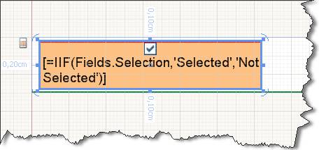
The textual part of the Checkbox report item supports [embedded expressions]({%slug telerikreporting/designing-reports/connecting-to-data/expressions/using-expressions/overview%}) for mail merge functionality.
Embedded expressions enable you to get and insert data-driven information directly into the CheckBox.Text property to produce customized reports and mail merging.
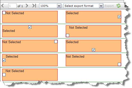
In the following image, each CheckBox is initialized with the CheckAlign property varying from TopLeft to BottomRight.
The check mark image depends on the value set in the Value property. By default, Value accepts =true or =false. At design time, you can initialize the Value property with an expression which later at runtime is evaluated to one of the System.Windows.Forms.CheckState values. For example, =IsNull(Fields.Quantity, 0) > 100 will return true or false and will check and uncheck the check mark respectively.
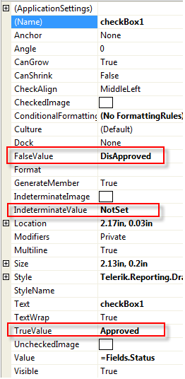
If your data fields return two or three distinctive values, which are not true or false, you can change the TrueValue, FalseValue, or IndeterminateValue properties to match your field values directly.
The TrueValue and FalseValue should be always set. If not, the Checked and Unchecked states become indetermined and you cannot show the corresponding images and check states. Generally, the TrueValue and FalseValue should be different. In the unexpected scenario where the two evaluate to the same value, the FalseValue will be prioritized, and the Checked state would become impossible to achieve.
tip If the checkbox
Valuemay take more than three values, all values that are different from theTrueValueandFalseValuewill be evaluated to theIndeterminateValue.
Example
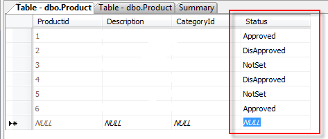
The following example assumes that you have a Status field that has the Approved, DisApproved, and NotSet values.
In this case, it is more convenient to use those values directly instead of trying to evaluate them as true or false. To use the values directly, utilize the TrueValue, FalseValue, and IndeterminateValue properties.
The following image shows the final result.
Next Steps
- [Using Embedded Expressions]({%slug telerikreporting/designing-reports/connecting-to-data/expressions/using-expressions/overview%})
- (API) Telerik.Reporting.CheckBox
- (API) CanGrow
- (API) CanShrink
- (API) CheckAlign
- Demo Page for Telerik Reporting
- Knowledge Base Section


