6.3 KiB
| title | page_title | description | position | slug |
|---|---|---|---|---|
| Styling | Xamarin Date Picker Documentation | Styling | Check our "Styling" documentation article for Telerik DatePicker for Xamarin control. | 8 | date-picker-styling |
Styling
DatePicker Styling
Date Picker control for Xamarin provides the following Style properties for customizing its look:
- SpinnerStyle(of type Style with target type telerikDataControls:RadSpinner): Defines the style applied to the spinner item and selected item.
- SpinnerHeaderStyle(of type Style with target type Xamarin.Forms.Label): Specifies the style applied to each spinner header label.
- SelectionHighlightStyle(of type Style with target type telerikPrimitives:RadBorder): Specifies the style applied to the border highlights the selection.
- PlaceholderLabelStyle(of type Style with target type Xamarin.Forms.Label): Specifies the style applied to the label defined in the [default PlaceholderTemplate]({%slug date-picker-templates%}#default-placeholdertemplate).
- DisplayLabelStyle(of type Style with target type Xamarin.Forms.Label): Defines the style applied to the label which is visualized when date is selected.
PickerContentView class exposes the following properties for styling the DatePicker Border and Background Color:
- BackgroundColor(Xamarin.Forms.Color): Defines the background color of the picker.
- BorderColor(Xamarin.Forms.Color): Defines the border color of the picker.
- BorderThickness(Xamarin.Forms.Thickness): Specifies the border thickness of the picker. Default value is
new Thickness(0,0,0,1). - CornerRadius(Xamarin.Forms.Thinckness): Specifies the corner radius of the picker.
Popup Styling
Using the SelectorSettings property (of type Telerik.XamarinForms.Input.PickerPopupSelectorSettings) of the DatePicker you can modify the appearance of the dialog (popup). PickerPopupSelectorSettings class exposes the following Style properties:
- PopupViewStyle(of type Style with target type telerikInput:PickerPopupContentView): Defines the popup view style.
- HeaderStyle(of type Style with target type telerikInput:PickerPopupHeaderView): Defines the popup header style.
- HeaderLabelStyle(of type Style with target type Xamarin.Forms.Label): Defines the popup header label style.
- FooterStyle(of type Style with target type telerikInput:PickerPopupFooterView): Defines the popup footer style.
- AcceptButtonStyle(of type Style with target type Xamarin.Forms.Button): Defines the Accept button style.
- CancelButtonStyle(of type Style with target type Xamarin.Forms.Button): Defines the Cancel button style.
The SelectorSetting also provides the following properties for popup customization:
-
PopupOutsideBackgroundColor(Xamarin.Forms.Color): Defines the color outside of the popup.
-
IsPopupModal(bool): Defines a boolean value indicating if the popup should be closed when tapped outside of the popup. By default the value of the IsPopupModal is false.
- When IsPopupModal="True" the UI behind the popup gets inactive and cannot be used until the popup is closed.
- When IsPopupModal="False" the popup could be closed when clicking outside the popup.
-
HeaderLabelText(string): Specifies the text visualized in the popup header.
-
IsHeaderVisible(bool): Specifies whether the Popup header is currently visible. By default the valuse is True.
-
IsFooterVisible(bool): Specifies whether the Popup footer is currently visible. By default the valuse is True.
-
AcceptButtonText(string): Defines the text visualized for the accept button. By default the text is OK.
-
CancelButtonText(string): Defines the text visualized for the cancel button. By default the text is Cancel.
Namespaces
Using PopupViewStyle, HeaderStyle, FooterStyle you will need to add the following namespace:
xmlns:telerikInput="clr-namespace:Telerik.XamarinForms.Input;assembly=Telerik.XamarinForms.Input"
Using SelectionHighlightStyle you need to add the following namespace:
xmlns:telerikPrimitives="clr-namespace:Telerik.XamarinForms.Primitives;assembly=Telerik.XamarinForms.Primitives"
Using SpinnerStyle you need to add the following namespace:
xmlns:telerikDataControls="clr-namespace:Telerik.XamarinForms.DataControls;assembly=Telerik.XamarinForms.DataControls"
Example
Here is a sample example that shows how the styling properties are applied.
A sample Date Picker definition:
and here are how the styles are defined in the page resources
Spinner Style
SpinnerHeader Style
SelectionHighlight Style
PlaceholderLabel Style
DisplayLabel Style
PopupView Style
Header Style
HeaderLabel Style
Footer Style
AcceptButton Style
CancelButton Style
Namespaces
In addition, add the following namespaces:
xmlns:telerikInput="clr-namespace:Telerik.XamarinForms.Input;assembly=Telerik.XamarinForms.Input"
xmlns:telerikDataControls="clr-namespace:Telerik.XamarinForms.DataControls;assembly=Telerik.XamarinForms.DataControls"
xmlns:telerikPrimitives="clr-namespace:Telerik.XamarinForms.Primitives;assembly=Telerik.XamarinForms.Primitives"
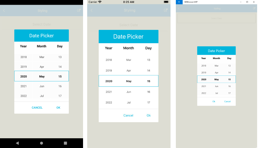
This is how the Date Picker control looks when the styles described above are applied:
important A sample Styling example can be found in the DatePicker/Features folder of the [SDK Samples Browser application]({%slug developer-focused-examples%}).
See Also
- [Key Features]({%slug date-picker-key-features%})
- [Templates]({%slug date-picker-templates%})
- [Commands]({%slug date-picker-commands%})
- [Visual Structure]({%slug date-picker-visual-structure%})
