Co-authored-by: microsoft-github-policy-service[bot] <77245923+microsoft-github-policy-service[bot]@users.noreply.github.com> |
||
|---|---|---|
| .github/workflows | ||
| assets | ||
| src | ||
| stringResources | ||
| style | ||
| test | ||
| .gitignore | ||
| .npmignore | ||
| CHANGELOG.md | ||
| LICENSE | ||
| README.md | ||
| SECURITY.md | ||
| capabilities.json | ||
| eslint.config.mjs | ||
| karma.conf.ts | ||
| package-lock.json | ||
| package.json | ||
| pbiviz.json | ||
| test.tsconfig.json | ||
| test.webpack.config.js | ||
| tsconfig.json | ||
README.md
Dual KPI Custom Visual
Overview
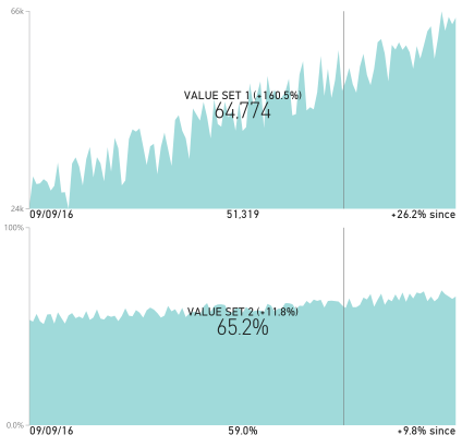
Each KPI can be visualized as line chart or area chart. The visual has dynamic behavior and can show historical value and the change from the latest value when you hover over it. It also has small icons and labels to convey KPI definitions and alerts about data freshness. Customize colors, titles, axis properties, tooltips, and more, to create visually appealing and functional executive dashboards.
Description
Dual KPI efficiently visualizes two measures over time. It shows their trend based on a joint timeline, while absolute values may use different scales, for example Profit and Market share or Sales and Profit. Each KPI can be visualized as line chart or area chart. The visual has dynamic behavior and can show historical value and the change from the latest value when you hover over it. It also has small icons and labels to convey KPI definitions and alerts about data freshness. Customize colors, titles, axis properties, tooltips, and more, to create visually appealing and functional executive dashboards.
Data fields
Axis Values for the x-axis of both charts. Must be a date.
Top values Values for the top chart. Number or percentage values supported.
Bottom values Values for the bottom chart. Number or percentage values supported.
Warning state This should be a column with only one numerical value. If the value is a negative number, a warning icon will be shown in the bottom left of the visual. The tooltip for this icon can be configured in the formatting pane.
Top - % change start date (mm/dd/yyyy) This should be a column with only one date value that represents the date from which the percent change calculation in the top chart should start. By default the visual calculates and displays the percent change across the entire dataset. This date can also be configured from the formatting options.
Bottom - % change start date (mm/dd/yyyy) Same as "Top - % change start date", but for the percentage change value displayed in the bottom chart.
Formatting Options
Title text Set the title text at the bottom of the visual
Abbreviate values If set to true, the data values shown in the chart will be abbreviate with standard SI units. For example, 100,000 would be abbreviated to 100K.
Top chart tooltip text This text will be inserted into the tooltip for the data displayed in the center of the top chart. By default, the tooltip shows the percent change information. This text will be prepended to that.
Bottom chart tooltip text Same as "Top chart tooltip text", but for the bottom chart.
Warning tooltip text Text to show in the tooltip for the warning icon
Show stale data warning Toggle on/off showing a stale data icon in the bottom right of the visual. This icon will only be shown if the stale data threshold is exceeded. For example, you can configure this warning to display if the data in the visual is more than a week old.
Stale data tooltip text Text to show in the tooltip for the stale data icon
Stale data threshold Number of days old the latest date in the dataset can be before showing the stale data icon. Default is 2 days.
Top - % change start date (mm/dd/yyyy) See explanation above in data fields section for "Top - % change start date".
Bottom - % change start date (mm/dd/yyyy) See explanation above in data fields section for "Bottom - % change start date"
Data color Set the color of the plotted values
Text color Set color of the text the overlays each chart
Chart opacity Set the the opacity of the plotted values
Top chart axis min Set the minimum value of the axis on the top chart
Top chart axis max Set the maximum value of the axis on the bottom chart
Bottom chart axis min Set the minimum value of the axis on the bottom chart
Bottom chart axis max Set the maximum value of the axis on the bottom chart
Top chart zero line Render an x-axis line at wherever y equals 0. This is helpful in charts that are displaying negative values. It helps to see at what point the data crosses into the negative range.
Bottom chart zero line Same as "Top chart zero line", but for the bottom chart
Top chart type Toggle the top chart between an area chart or a line chart
Bottom chart type Toggle the bottom chart between an area chart or a line chart
See also Dual KPI at Microsoft Office store
