зеркало из
1
0
Форкнуть 0
Pulse chart shows a line chart annotated with key events. Each events can be selected to filter and cross highlight other visuals to reveal insights or help tell a story. Pulse chart supports animation so you can load your report and watch it play through key events, without user interaction. This visualization is perfect for story telling with data, especially the Power BI publish to web feature. Use it anywhere you need to draw attention to events that shaped a trend.
Перейти к файлу
microsoft-github-policy-service[bot] 6c7502e218
Microsoft mandatory file (#105)
Co-authored-by: microsoft-github-policy-service[bot] <77245923+microsoft-github-policy-service[bot]@users.noreply.github.com>
2024-06-07 12:43:55 +04:00
.github/workflows Update snyk.yml 2021-12-21 18:13:25 +07:00
.vscode Webpack integration (#35) 2018-10-09 13:05:00 +03:00
assets 19976 Pulse Chart: Include short and long description from Office Store to repo (#17) 2017-07-28 14:36:39 +03:00
src Add context menu and tooltips (#89) 2022-02-18 18:49:11 +07:00
stringResources Localization strings from utils update (#24) 2018-05-21 18:48:10 +07:00
style Update outdated packages (#87) 2021-12-21 21:16:10 +07:00
test Dev/v nsmirnova/update testutils (#97) 2022-02-24 19:41:06 +07:00
.editorconfig Add stage linted and hooks (#12) 2017-05-27 15:24:55 +03:00
.gitignore IE 11 fix (#40) 2019-01-30 12:35:13 +03:00
.snyk fix: .snyk, package.json & package-lock.json to reduce vulnerabilities (#42) 2020-01-15 13:23:42 +03:00
.stylelintrc visual dependencies update and azure pipelines integration added (#37) 2018-10-26 20:14:42 +07:00
.travis.yml High contrast mode (#33) 2018-08-01 12:38:27 +03:00
CHANGELOG.md Bug fixing (#41) 2019-02-04 11:25:52 +03:00
README.md Update README.md 2021-12-21 17:44:26 +07:00
SECURITY.md Microsoft mandatory file (#105) 2024-06-07 12:43:55 +04:00
azure-pipelines.yml visual dependencies update and azure pipelines integration added (#37) 2018-10-26 20:14:42 +07:00
capabilities.json Add context menu and tooltips (#89) 2022-02-18 18:49:11 +07:00
karma.conf.ts Update outdated packages (#87) 2021-12-21 21:16:10 +07:00
package-lock.json Dev/v nsmirnova/update testutils (#97) 2022-02-24 19:41:06 +07:00
package.json Fix lint issue (#100) 2022-03-02 21:40:40 +07:00
pbiviz.json Fix lint issue (#100) 2022-03-02 21:40:40 +07:00
test.tsconfig.json Webpack integration (#35) 2018-10-09 13:05:00 +03:00
test.webpack.config.js Update outdated packages (#87) 2021-12-21 21:16:10 +07:00
tsconfig.json Webpack integration (#35) 2018-10-09 13:05:00 +03:00
tslint.json Update outdated packages (#87) 2021-12-21 21:16:10 +07:00

README.md

BuildCoverage Status

Line chart annotated with key events. Perfect for story telling with data.

stacked area chart screenshot

Overview

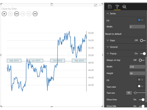
The Pulse chart shows key events on a timeline, and lets you play back the events to reveal insights.

The Pulse Chart allows you to playback the data to see the trend unfold in front of your eyes. When an event appears, the playback pauses to filter the rest of the report, revealing hidden relationships. You can use this feature to grab your audiences attention and highlight specific insights. Theres an auto play feature that starts the playback when the report loads. Pulse Charts are ideal for use with publish to web or when sharing reports with your coworkers.

When a data point is selected on the Pulse Chart, you get a customizable popup. You can specify the title and description, and show or hide the timestamp as well. This lets you clearly call attention to whats important about the data point.

Creating a Pulse Chart is really easy - you just need to provide data that is a time series. You add columns to the time series data that define the events you want to show on the line. For those columns, non-blank values become events and are shown as circles on the Pulse chart.

See also Pulse Chart at Microsoft AppSource