7.1 KiB
| layout | title | description | platform | control | documentation |
|---|---|---|---|---|---|
| post | Getting Started with Blazor Dialog Component | Syncfusion | Checkout and learn about getting started with Blazor Dialog component of Syncfusion, and more details. | Blazor | Dialog | ug |
Getting Started with Blazor Dialog Component
This section briefly explains how to include a Dialog component in your Blazor Server-side application. You can refer to our Getting Started with Syncfusion Blazor Server-Side Popups in Visual Studio page for the introduction and configuring the common specifications.
To get start quickly with Blazor Dialog component, you can check on this video: {% youtube "youtube:https://www.youtube.com/watch?v=uSyGKuB8ghg"%}
Importing Syncfusion Blazor component in the application
-
Install Syncfusion.Blazor.Popups NuGet package to the application by using the NuGet Package Manager.
-
You can add the client-side resources through CDN or from NuGet package in the HEAD element of the ~/Pages/_Host.cshtml page.
<head>
  <environment include="Development">
  ....
  ....
    <link href="_content/Syncfusion.Blazor/styles/fabric.css" rel="stylesheet" />
    <!---CDN--->
    @*<link href="https://cdn.syncfusion.com/blazor/18.4.42/styles/fabric.css" rel="stylesheet" />*@
  </environment>
</head>
For Internet Explorer 11 kindly refer the polyfills. Refer the documentation for more information.
<head>
   <environment include="Development">
      <link href="_content/Syncfusion.Blazor/styles/fabric.css" rel="stylesheet" />
      <script src="https://github.com/Daddoon/Blazor.Polyfill/releases/download/3.0.1/blazor.polyfill.min.js"></script>
  </environment>
</head>
Adding component package to the application
Open ~/_Imports.razor file and import the Syncfusion.Blazor.Popups package.
@using Syncfusion.Blazor.Popups
Add SyncfusionBlazor service in Startup.cs
Open the Startup.cs file and add services required by Syncfusion components using services.AddSyncfusionBlazor() method. Add this method in the ConfigureServices function as follows.
using Syncfusion.Blazor;
namespace BlazorApplication
{
    public class Startup
    {
        ....
        ....
        public void ConfigureServices(IServiceCollection services)
        {
            ....
            ....
            services.AddSyncfusionBlazor();
        }
    }
}
Add Dialog component
To initialize the Dialog component, add the below code to your Index.razor view page which is present under ~/Pages folder.
The following code explains how to initialize a simple Dialog in Razor page.
@using Syncfusion.Blazor.Popups

<SfDialog Width="250px">
    <DialogTemplates>
        <Content> This is a Dialog with content </Content>
    </DialogTemplates>
</SfDialog>
Run the application
After successful compilation of your application, simply run the application.
The output will be as follows.
- In the dialog control, max-height is calculated based on the dialog target element height. If the Target property is not configured, the document.body is considered as a target. Therefore, to show a dialog in proper height, you need to add min-height to the target element.
- If the dialog is rendered based on the body, then the dialog will get the height based on its body element height. If the height of the dialog is larger than the body height, then the dialog's height will not be set. For this scenario, we can set the CSS style for the html and body to get the dialog height.
html, body {
   height: 100%;
}
Modal dialog
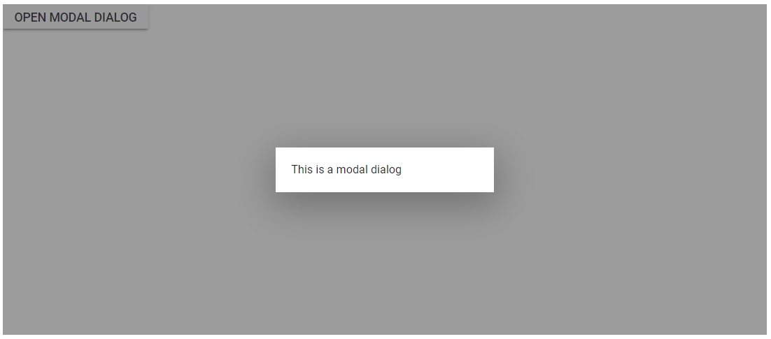
A modal shows an overlay behind the Dialog. So, the users should interact the Dialog compulsory before interacting with the remaining content in an application.
While the user clicks the overlay, the action can be handled through the OnOverlayClick event. In the following code, it explains the Dialog close action performed while clicking the overlay.
@using Syncfusion.Blazor.Popups
@using Syncfusion.Blazor.Buttons

<SfButton @onclick="@OpenDialog">Open Modal Dialog</SfButton>

<SfDialog Width="250px" IsModal="true" @bind-Visible="@IsVisible">
    <DialogEvents OnOverlayClick="@OnOverlayclick">
    </DialogEvents>
    <DialogTemplates>
        <Content> This is a modal dialog </Content>
    </DialogTemplates>
</SfDialog>

@code {
    private bool IsVisible { get; set; } = true;

    private void OpenDialog()
    {
        this.IsVisible = true;
    }

    private void OnOverlayclick(MouseEventArgs arg)
    {
        this.IsVisible = false;
    }
}
The output will be as follows.
Enable header
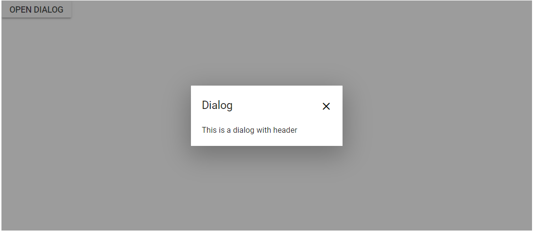
The Dialog header can be enabled by adding the header content as text or HTML content using the Header template of the dialog.
@using Syncfusion.Blazor.Popups
@using Syncfusion.Blazor.Buttons

<SfButton @onclick="@OpenDialog">Open Dialog</SfButton>

<SfDialog Width="250px" ShowCloseIcon="true" IsModal="true" @bind-Visible="@IsVisible">
    <DialogTemplates>
        <Header> Dialog </Header>
        <Content> This is a dialog with header </Content>
    </DialogTemplates>
</SfDialog>

@code {
    private bool IsVisible { get; set; } = true;

    private void OpenDialog()
    {
        this.IsVisible = true;
    }
}
The output will be as follows.
Render Dialog with buttons
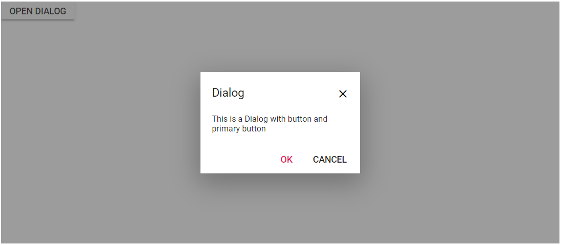
By adding the DialogButtons can render a Dialog with buttons in Razor page.
@using Syncfusion.Blazor.Popups
@using Syncfusion.Blazor.Buttons

<SfButton @onclick="@OpenDialog">Open Dialog</SfButton>

<SfDialog Width="250px" ShowCloseIcon="true" IsModal="true" @bind-Visible="@IsVisible">
    <DialogTemplates>
        <Header> Dialog </Header>
        <Content> This is a Dialog with button and primary button </Content>
    </DialogTemplates>
    <DialogButtons>
        <DialogButton Content="OK" IsPrimary="true" OnClick="@CloseDialog" />
        <DialogButton Content="Cancel" OnClick="@CloseDialog" />
    </DialogButtons>
</SfDialog>

@code {
    private bool IsVisible { get; set; } = true;

    private void OpenDialog()
    {
        this.IsVisible = true;
    }

    private void CloseDialog()
    {
        this.IsVisible = false;
    }
}
The output will be as follows.


