5.5 KiB
| layout | title | description | platform | control | documentation |
|---|---|---|---|---|---|
| post | Indicating the selected item in Xamarin Segmented Control | Syncfusion | Learn here all about Indicating the selected item support in Syncfusion Xamarin Segmented Control (SfSegmentedControl) and more. | Xamarin | SegmentedControl | ug |
Indicating the selected item in Xamarin Segmented Control
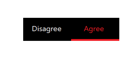
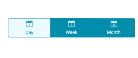
The segmented control indicates the selected item by differentiating it with text color of the item or using selection strip.
Selection text color
You can change the text color of the selected item to desired color. The selected item's text color can be customized using the SelectionTextColor property.
{% tabs %}
{% highlight xaml %}
<buttons:SfSegmentedControl SelectionTextColor="#02A0AE"/>
{% endhighlight %}
{% highlight c# %}
segmentedControl.SelectionTextColor = Color.FromHex("#02A0AE");
{% endhighlight %}
{% endtabs %}
Selection strip
A selection strip is used to indicate the selected item in the segmented control. The selection strip can be customized in many forms.
Position
The position of the selection indicator can be customized in different ways.
Top
The selection strip can be displayed as a line with customizable color and thickness. It can be positioned at the top of an item.
{% tabs %}
{% highlight xaml %}
buttons:SfSegmentedControl.SelectionIndicatorSettings <buttons:SelectionIndicatorSettings Position="Top"> </buttons:SelectionIndicatorSettings> </buttons:SfSegmentedControl.SelectionIndicatorSettings>
{% endhighlight %}
{% highlight c# %}
SelectionIndicatorSettings selectionIndicator = new SelectionIndicatorSettings(); selectionIndicator.Position = Position.Top; segmentedControl.SelectionIndicatorSettings = selectionIndicator;
{% endhighlight %}
{% endtabs %}
Bottom
Like top placement, selection strip can be customized by its color and thickness and can be positioned at the bottom of an item.
{% tabs %}
{% highlight xaml %}
buttons:SfSegmentedControl.SelectionIndicatorSettings <buttons:SelectionIndicatorSettings Position="Bottom"> </buttons:SelectionIndicatorSettings> </buttons:SfSegmentedControl.SelectionIndicatorSettings>
{% endhighlight %}
{% highlight c# %}
SelectionIndicatorSettings selectionIndicator = new SelectionIndicatorSettings(); selectionIndicator.Position = Position.Bottom; segmentedControl.SelectionIndicatorSettings = selectionIndicator;
{% endhighlight %}
{% endtabs %}
Fill
The selection strip can be placed over a segment item to indicate the selection. You can customize its color to highlight the item.
{% tabs %}
{% highlight xaml %}
buttons:SfSegmentedControl.SelectionIndicatorSettings <buttons:SelectionIndicatorSettings Position="Fill"> </buttons:SelectionIndicatorSettings> </buttons:SfSegmentedControl.SelectionIndicatorSettings>
{% endhighlight %}
{% highlight c# %}
SelectionIndicatorSettings selectionIndicator = new SelectionIndicatorSettings(); selectionIndicator.Position = Position.Fill; segmentedControl.SelectionIndicatorSettings = selectionIndicator;
{% endhighlight %}
{% endtabs %}
Border
The selection strip can be set as a border to highlight the selected item.
{% tabs %}
{% highlight xaml %}
buttons:SfSegmentedControl.SelectionIndicatorSettings <buttons:SelectionIndicatorSettings Position="Border"> </buttons:SelectionIndicatorSettings> </buttons:SfSegmentedControl.SelectionIndicatorSettings>
{% endhighlight %}
{% highlight c# %}
SelectionIndicatorSettings selectionIndicator = new SelectionIndicatorSettings(); selectionIndicator.Position = Position.Border; segmentedControl.SelectionIndicatorSettings = selectionIndicator;
{% endhighlight %}
{% endtabs %}
Color
The background color of the selection strip can be customized using the Color property of SelectionIndicatorSettings.
{% tabs %}
{% highlight xaml %}
buttons:SfSegmentedControl.SelectionIndicatorSettings <buttons:SelectionIndicatorSettings Color="#2C7BBC"> </buttons:SelectionIndicatorSettings> </buttons:SfSegmentedControl.SelectionIndicatorSettings>
{% endhighlight %}
{% highlight c# %}
SelectionIndicatorSettings selectionIndicator = new SelectionIndicatorSettings(); selectionIndicator.Color = Color.FromHex("#2C7BBC"); segmentedControl.SelectionIndicatorSettings = selectionIndicator;
{% endhighlight %}
{% endtabs %}
Thickness
The border thickness of the selection strip can be customized using the Thickness property of SelectionIndicatorSettings.
{% tabs %}
{% highlight xaml %}
buttons:SfSegmentedControl.SelectionIndicatorSettings <buttons:SelectionIndicatorSettings StrokeThickness="10"> </buttons:SelectionIndicatorSettings> </buttons:SfSegmentedControl.SelectionIndicatorSettings>
{% endhighlight %}
{% highlight c# %}
SelectionIndicatorSettings selectionIndicator = new SelectionIndicatorSettings(); selectionIndicator.StrokeThickness = 10; segmentedControl.SelectionIndicatorSettings = selectionIndicator;
{% endhighlight %}
{% endtabs %}


