Update library and samples to use Xamarin.Forms 5 |
||
|---|---|---|
| images | ||
| src | ||
| .gitattributes | ||
| .gitignore | ||
| LICENSE | ||
| README.md | ||
README.md
TemplateUI
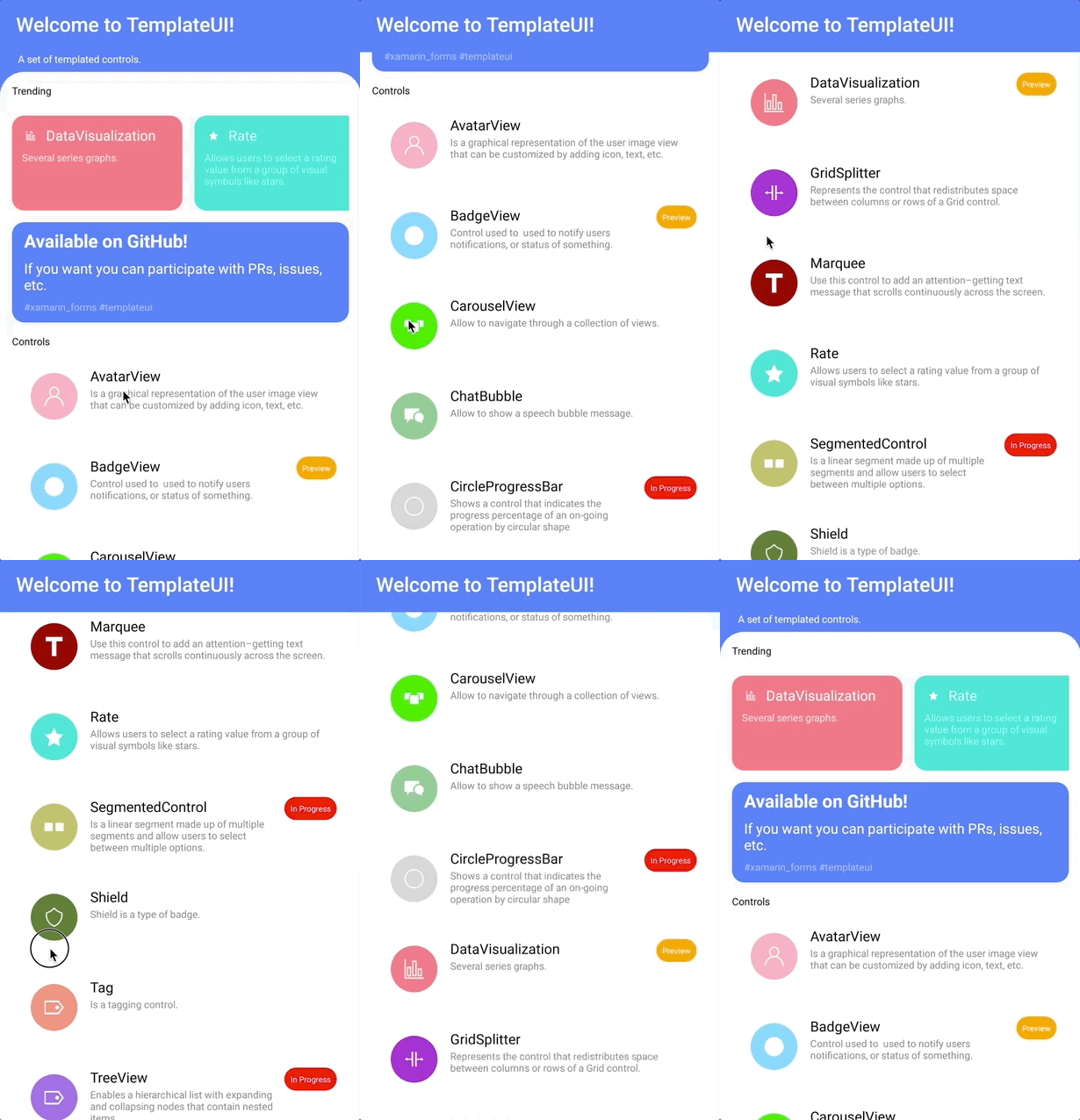
A set of templated controls.
Supported platforms:
- Android
- iOS
- macOS
- UWP
What is a templated control?
It is a control defined by a template. Every control has a ControlTemplate property and can modify the structure that defines the control.
Usage
Step 1: Add a reference to TemplateUI.
NOTE: Currently TemplateUI is not yet available in NuGet. But... why?. There are a couple more controls and some fixes almost ready. After merge and polish details, TemplateUI will be in NuGet.
Step 2: Initialize TemplateUI in your shared library:
TemplateUI.Init();
Step 3: Enjoy coding!.
Overview
There are currently 18 controls. The controls available are:
Controls
The controls available are:
AvatarView
Is a graphical representation of the user image view that can be customized by adding icon, text, etc.
BadgeView
Control used to used to notify users notifications, or status of something.

CarouselView
Allow to navigate through a collection of views.

ChatBubble
Allow to show a speech bubble message.

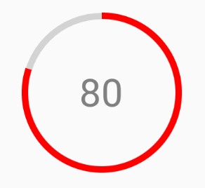
CircleProgressBar
Shows a control that indicates the progress percentage of an on-going operation by circular shape.
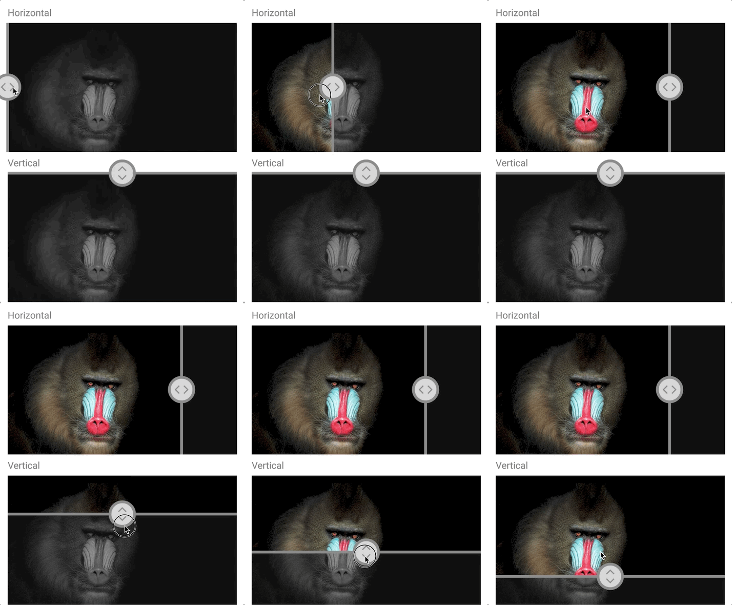
ComparerView
Provides an option for displaying a split-screen of two views, which can help you to make comparisons.
DataVisualization
Several series graphs.

Divider
Displays a separator between views.

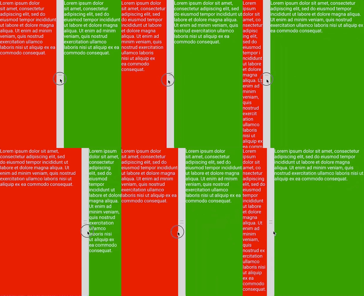
GridSplitter
Represents the control that redistributes space between columns or rows of a Grid control.
Marquee
Use this control to add an attention–getting text message that scrolls continuously across the screen.

PinBox
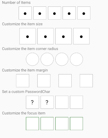
Allow to introduce a PIN or verification Code.
ProgressBar
Represents progress as a horizontal bar that is filled to a percentage represented by a float value.

Rate
Allows users to select a rating value from a group of visual symbols like stars.

SegmentedControl
Is a linear segment made up of multiple segments and allow users to select between multiple options.

Shield
Shield is a type of badge.

Slider
Is a horizontal bar that can be manipulated by the user to select a double value from a continuous range.

SnackBar
Provide brief messages about app processes at the bottom of the screen.

Tag
Is a tagging control.

ToggleSwitch
A View control that provides a toggled value.

TreeView
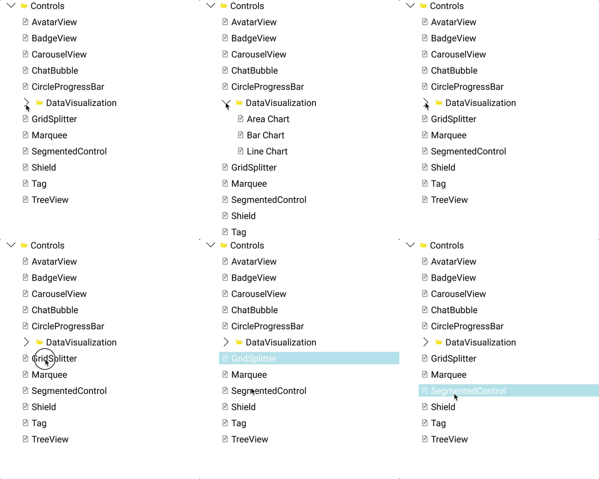
Enables a hierarchical list with expanding and collapsing nodes that contain nested items.
Layouts
But ... isn't this a templated controls library? You are right. But to create certain controls, there are layouts that would help to achieve the desired result. For example, in the list of upcoming controls we have a Clock. To position the elements that make up the Clock, a CircularLayout makes things very simple.
These Layouts, in addition to adding more possibilities to the library, help to create more templated controls.
The layouts available are:
CircularLayout
The CircularLayout is a simple Layout derivative that lays out its children in a circular arrangement. It has some useful properties to allow some customization like the Orientation (Clockwise or Counterclockwise).

DockLayout
The DockLayout makes it easy to dock content in all four directions (top, bottom, left and right). This makes it a great choice in many situations, where you want to divide the screen into specific areas, especially because by default, the last element inside the DockLayout, unless this feature is specifically disabled, will automatically fill the rest of the space (center).

HexLayout
A Layout that arranges the elements in a honeycomb pattern.

Contribute
Do you want to contribute?.
Found a Bug?
If you find a bug, you can help me by submitting an issue. Even better, you can submit a Pull Request with a fix.
Submitting a pull request
For every contribution, you must:
- Test your code.
- target master branch (or an appropriate release branch if appropriate for a bug fix).
Adding documentation
To update the documentation, you must submit a Pull Request adding or updating the existing markdowns.
Feedback or Requests
Use GitHub Issues for bug reports and feature requests.
Principles
- Principle #1: Kept TemplateUI simple.
- Principle #2: Any control added must allow customization using the ControlTemplate property.
Known Issues
- A lot of the controls are made up of basic shapes. Gestures don't work with Shapes on iOS. This affects some control like Rate. (waiting PR #11419)
What's next
The next controls will be:
- Clock
- TabView
In addition, there are ideas for a wide variety of controls like:
- Calendar
- ColorPicker
- DataGrid
- Horizontal Calendar
- Loading
- Pagination
- StepBar
- TimeBar
And much more!
Copyright and license
Code released under the MIT license.