Страница:
Create new metric
Страницы
Arm Parameters
Azure deployment
Cloud Deployment On Linux
Cloud Simulator
Cloud deployment
Configuring the Arm template
Create new metric
Creating your first pipeline in 5 minutes!
Data Accelerator with Databricks
Data Accelerator
Data Accumulator
Diagnose issues using Telemetry
FAQ
Find Applications For Your Environment
Home
Inviting others and RBAC
Live query
Local Cloud Debugging
Local Tutorial Add an Alert
Local Tutorial Adding SQL to your flow and outputs to Metrics dashboard
Local Tutorial Advanced Aggregate alerts
Local Tutorial Creating your first Flow in local mode
Local Tutorial Custom schema
Local Tutorial Debugging using Spark logs
Local Tutorial Extending with UDF UDAF custom code
Local Tutorial Outputs to disk
Local Tutorial Reference data
Local Tutorial Scaling the docker host
Local Tutorial Tag Aggregate to metrics
Local Tutorial Tag Rules output to local file
Local create metric
Local mode with Docker
Local running sample
Output data to Azure SQL Database
Run Data Accelerator Flows on Databricks
Scale
Schedule batch job
Set up aggregate alert
Set up new outputs
Set up simple alert
Spark logs
Tagged data flowing to CosmosDB
Tagging aggregate rules
Tagging simple rules
Tutorials
Upgrade Existing Data Accelerator Environment to v1.1
Upgrade Existing Data Accelerator Environment to v1.2
Use Input in different tenant
Windowing functions
functions
readme
reference data
sql query
3
Create new metric
Carl Brochu редактировал(а) эту страницу 2019-05-09 14:56:38 -07:00
Содержание
Metrics dashboard allows you to create your own metrics. This is useful when you want to debug or simply see the shape of data. In this tutorial you will learn how to create your own metric that will show up on the Metrics dashboard.
Steps to follow
-
Open or create a flow using first tutorial to create a pipeline in 5 minutes
-
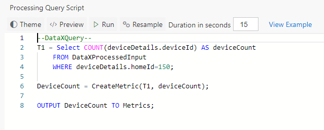
Switch to the Query tab. Let's say we wanted to plot a chart for the count of devices sending data for house number 150. To do so, first, write a query to find the device count for house 150.
--DataXQuery--
T1 = Select COUNT(deviceDetails.deviceId) AS deviceCount
    FROM DataXProcessedInput
    WHERE deviceDetails.homeId=150;
- Now use CreateMetric() API to create the metric. This API takes as input the table and column that has the information to plot on the Metrics dashboard. It returns a table which you want to output to the Metrics dashboard.
DeviceCount = CreateMetric(T1, deviceCount);

OUTPUT DeviceCount TO Metrics;
-
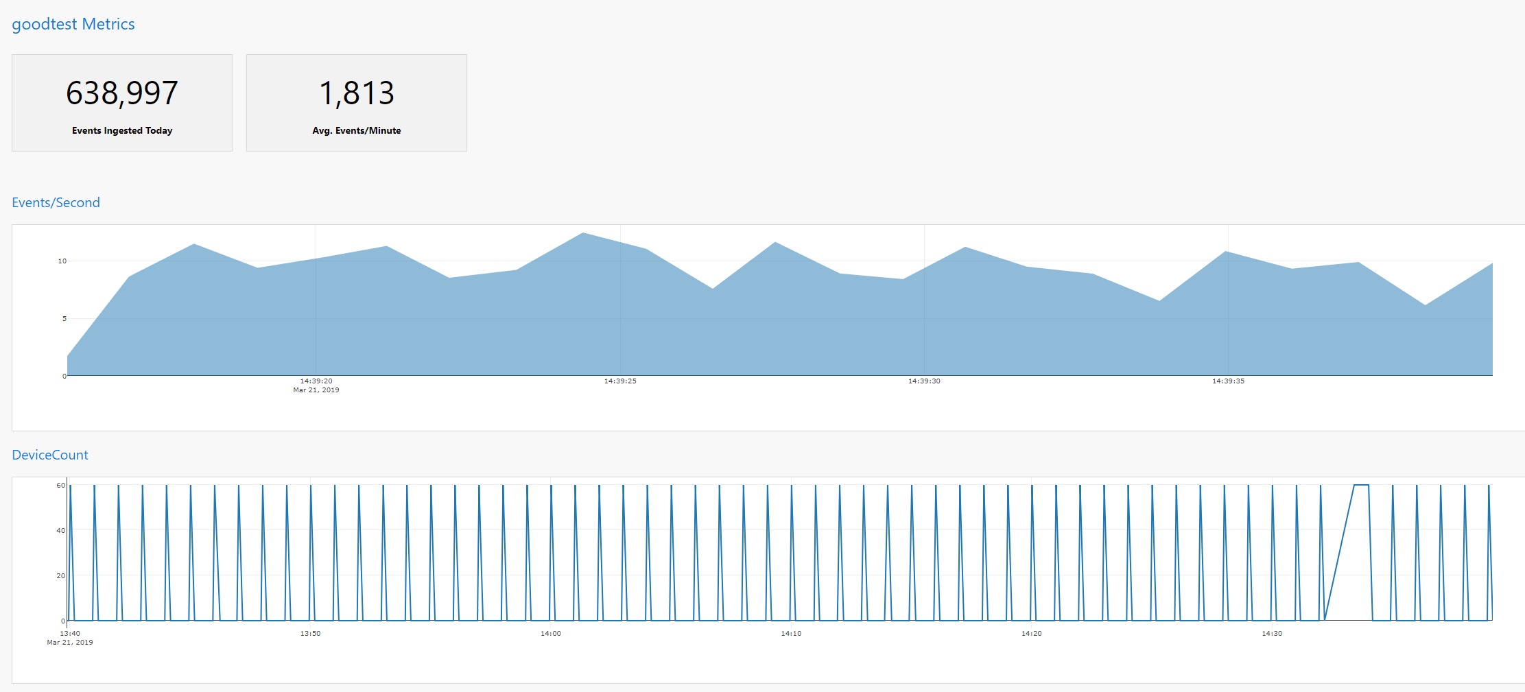
Click "Deploy" button. That's it! You have now created a chart called 'DeviceCount' that will show up on Metrics dashboard.
View Metrics
Note
- You can also OUTPUT multiple Tables to Metrics as shown below (from the home automation sample). This will create a multi-line chart. Code snippet:
OUTPUT GarageDoorStatusOneForLocked, GarageDoorSlidingMinutesOpenedIn5minutes, GarageMinutesOpenedInAnHour TO Metrics;


